| |||||||||||||||||||||
| |||||||||||||||||||||
Hi, Tog
I've just been given the job of re-structuring a large set of web pages. The pages are to be used in 2 main ways:
- as a reference
- as a structured tutorial.
My problem is deciding how to implement my navigation bar. I'd like my bar to fulfill 2 functions:
give users a clear indication of where they are
let them get where they want to quickly.
My users will be using a large range of PCs, from very low spec to high spec, many probably viewing pages on 14" screens at 640x480 resolution. So graphic solutions musn't take up too much space.
Anyway what's a guy to do? The site is going to have 4 levels of hierarchy, so possible solutions are:
1. 'Main Menu' bar, i.e. links to each of the highest level sections of the navigation hierarchy (done as text links). The current section link given a different colour to distinguish position. Simple, but constricting.
2. Linear-sequence nav bar, like Nielsen's solution at useit.com where the route the user has taken gradually fills up the nav bar, allowing the user to jump back to previous levels they have come from to reach menu systems, but not allowing direct jumping to any other section at the level they are.
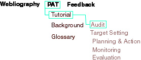
3. Many-level nav bar, where an extra layer gets added to the nav bar each time the user goes down a level so they can jump around at whatever layer of hierarchy they are at, as well as jump up to previous levels. Again, done either as text links or something like this:
This offers more freedom, but it's more hassle to implement and starts to take up valuable screen space.
Any ideas or preferences? Any help greatly appreciated. I did a lot of this sort of stuff on my HCI courses at University, but it gets real difficult when you have to deal with large information sites being navigated by users using low spec machines.
Cheers,
Stu
Let us assume for this discussion that such a deep hierarchy is unavoidable and let us further assume that the users are somewhat average people using the site with some frequency. (Were I to consult on this project, the first thing I would do is find out if four hierarchical levels are really necessary. Then I would want to know exactly who these users are.)
Nav bars for computer professionals serve one primary purpose: Giving us a fast way to get from point A to point B. They serve a second, often more important role for more average users: They give the user a map. Let's consider Stu's three alternatives in light of their mapping features. Solution one, the main menu, offers little help in building a mental model of the site. It is rather like having a state road map consisting of a single sheet of paper with the names of the five largest cities on it. No roads, no small towns.
Jakob's solution (2) has the advantage of being simple and compact. It is rather like the breadcrumb map of Hansel and Gretel, but with longer-lasting breadcrumbs (subject to the reliability of your system). It is targeted at computer professionals and, as such, is well-suited.
Stu's solution (3) really "turns on the lights." Users will know where they are, where they've been, and how to go to their next destination. It requires no mental-modeling and will aid learnability, as well as increase usability.
This solution does, as Stu pointed out, take up a fair amount of space. I would suggest sticking with the general concept, but let a graphic designer take a whack at it, producing four or five variations, with particular emphasis on collapsing the vertical height. For example, were the items in bold in a vertical column on the left, each of the subsequent columns could begin at the top of the page, rather than being staggered down. Not quite so eloquent as this design, but significantly more compact.
As I said in The Sorry State of Web Design, mapping such as this should become part of site management systems, offered by HTML editor vendors, as well as ISPs. Site webmasters should only have to pick a given style or design, with all the mapping happening automatically. As compact, easily-understood solutions emerge, they should become standard, so that users aren't faced with a diffferent design on each website. That hasn't happened yet, but it should not be much longer. In the meantime, Stu, you are definitely headed in the right direction.
Send your own questions to me. I'll either try to answer you personally or make your letter the centerpiece of next month's issue.
-Tog
|
|
Don't miss the next action-packed column! Receive a brief notice when new columns are posted by sending a blank email to asktoglist-subscribe@yahoogroups.com. |
| Contact Us: Bruce Tognazzini Copyright Bruce Tognazzini. All Rights Reserved |