NN/g Home  AskTog Panther: The Good, the Bad, and the Ugly AskTog Panther: The Good, the Bad, and the Ugly |
|
AskTog, January, 2004
Panther: The Good, the Bad, and the Ugly
|
|
14 year Apple veteran (employee #66) and founder of Apple's Human Interface Group speaks out on OS 10.3 |
|
Mac is indeed back! For the first time, with a few simple add-ons, you can turn your Mac into a monster machine, capable of outperforming not only an OS 9 Mac, but Windows XP (see: Make Your Mac a Monster Machine in this same issue).
For a long time, people have been writing me, asking that I do an in depth review of OS X. I held off because I really didn't think OS X was ready for prime time. That's all changed. OS X, in the form of the Panther release, is more than ready. This is a review, then, of what Mac is doing right and where they still need to improve.
|
Join my intensive (and fun!) lecture/ workshop course. Sign up now!
Interaction Design course: Go from zero to interaction designer in just three days.
You may be coming in cold from engineering or graphic design. You may already be an interaction designer wanting to "fills in the blanks," establishing a more solid theoretical and practical base. I've aimed this course at all of you, covering the needs of both individual contributors and managers.
Join me as I teach the Apple method and show you how to not only organize for and come up with successful designs, but sell them to engineering and upper management.
It's intensive, yes: A one-semester-equivalent with a strong, real-world bias. However, we have a lot of fun along the way, and you'll leave having worked with a team to design and build a complete project, so you will have not only learned, but experienced everything taught.
User Experience Conference Website There's more than my course at an NN/g conference. You'll find a breadth of other specialized courses and networking opportunities that will put you and your company at the leading edge of the design curve.
|
|
|
|
The Good |
|
Let's begin with a look at what's new and important in Panther, OS 10.3.
|
|
Speed |
|
OS X is up to speed at last. It appears as crisp, with a few exceptions, as OS 9.2.2. It’s obvious that the team has put in much effort in identifying and optimizing key bits of code, and that effort has paid off handsomely.
|
|
Exposé |
|
Exposé is remarkable. It offers much of the power of virtual desktops, but without the need for users to develop a complex mental model. Sweep all your current windows aside, carry out a new, contained Finder task, then sweep the windows back.
Exposé also lets you spread the windows out on the desktop, so you can find the one you want, previously hidden in the “stack.” Click on it and the windows will all take their previous positions, but with the chosen window on top.
Exposé makes full and proper use of Fitts’s Law. Throwing the mouse into your selected corner carries out your selected Exposé action.
This is the first instance I’ve seen of a major OS making purposeful use of corners to carry out major activities. I applaud Apple for this. The point directly below the current position of the mouse is the easiest target for users, prompting the rise of contextual menus. Next in line are the four corners. Throwing the mouse in the general direction of a side will result in the mouse arriving at the exact point of one of its corners. Corners have been languishing, largely unused, for the last 25 years.
Of course, everything can be improved, and Exposé is no exception. While you can carry out a complete Finder task, such a moving or copying documents from one folder to another, as soon as you open one of those documents, all the other windows come flying back. It would be nice to carry out a subtask that went beyond the finder while holding the rest of the document in abeyance.
For example, someone calls on the phone and you need to find and email a certain document. How nice to be able to just set everything else aside until that contained task is over, then bring back your previous work. Apple should experiment with a few solutions. Perhaps option-clicking the first document opened in the Finder would let Exposé know to stay expanded until explicitly called back. Perhaps the behavior could just simply be changed, requiring a second visit to the corner to open it back up. (This could be made an option, for backward compatibility.)
Exposé also needs an exclusion list. Some specialized OS X applications, ones that extend the Finder itself, should remain visible and accessible. These would include things like Drag Thing, which offers System 9-like tab menus and a desktop trash can.
Those of us who have become enamoured of Konfabulator widgets would also like to leave exposed during Exposé operations those of these miniature objects we have elected to embed in our desktop.

Cool Konfabulator Clock
Finally, Exposé needs to add a tiny delay before opening when the mouse is thrown into a corner. The corners are such pointer-magnets that users often arrive there by accident. Users, under OS 10.3, are now learning to slow up their mouse activities in general to avoid accidentally triggering Exposé. A delay of between 1/20th of a second and 1/10th of a second should be sufficient and will result in a significant speed increase in other nearby activities, such as accessing the Apple menu.
|
|
File Vault |
|
Apple's marketing message for File Vault is that it will allow a businessman to safely transport his laptop without fear of thieves gaining corporate secrets.
The real significance of File Vault is that it makes the Mac the first OS that protects privacy, rather than just security. For those who have not considered the difference, security is a scheme that ensures that only your corporate masters can find out what you are up to. Privacy means that only you can see what you are up to.
Perhaps the biggest difference between Apple and Microsoft has traditionally been that Microsoft supports corporations and Apple supports individuals. File Vault once again brings that difference into sharp focus. It actually has the potential to hurt sales to corporations that reserve their right to spy on you—hence the marketing spin that this is to protect corporate secrets on the road—but it once again clearly illuminates Apple as one of the good guys, a force in the world to slow down the seemingly inevitable advance of our Brave New World.
|
|
The Bad |
|
Yes, there is still bad lurking in Panther, but it is bad that can be overcome. See the companion article, Make Your Mac a Monster Machine.
|
|
Dock |
|
I have now changed my opinion about the Dock. Not that it doesn't still suck from a human-productivity point of view—it does—but I think that its ability to help close sales outweighs its general uselessness once users move beyond the naive stage.
The underlying problem with the Dock is that Apple appears to see it as a complete solution. In The Top 9 Reasons the Dock Still Sucks, I break it down for them, problem by problem, and suggest the strategy they need to follow to support users beyond the initial sale.
|
|
Information Density |
|
OS X screen objects are as much as seven times bigger than needed. That's dreadful!
Save Dialogs
• Save dialogs are so huge that they obscure the work beneath. There’s a reason we moved to moveable dialogs a decade ago: Sometimes you need to be able to see your work beneath. Save dialogs need to be easily shrinkable, hiding all the chrome, as well as the side bar, so we can again see enough beneath to enable context.
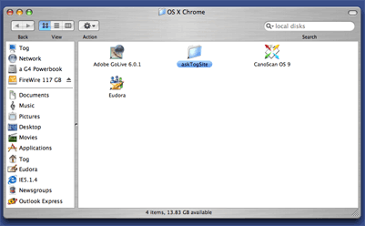
Finder Windows
• Finder windows open in a ridiculously wasteful size. This window, shown at half-size, is just as it appeared when opened for the first time under OS 10.3.
|
|
|
|
|
|
|
|
|
All that room for four measly icons. OS X hates to have icons anywhere near each other. The grid is huge and wasteful. There's also too much chrome, not enough car. Compare the above view with a screenshot of this same window at the same scale when I turned off the chrome and dragged the icons closer to each other:
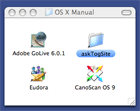
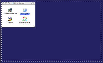
Yes, this is the exact same content, not crowded in at all, in a window which is one seventh the size of the original! There is nothing you can do in that giant window that you could not do in the classic view with a proper redesign. Still not convinced? Have a look at the "repaired" view inside the dotted outline of the original:
|
|
|
|
|
|
|
|
|
Do you have that much screen real estate to burn? I don't.
Microsoft also has huge, wasteful, low-density windows. They are also horrible, and Apple need not emulate them. Instead, Apple needs to:
- Design for density. A design team needs to examine this sharp downward turn in information density, identify each element of it, and address it in such a way that OS X at least meets, if not exceeds, the information density of OS 9.
- Allow users to set the classic view (no chrome) as the default for new windows
- Tighten the grid and make it dynamic as an option, so it does the best possible job under all circumstances.
- Augment the compact view so it is as useful as the chrome view. Clicking on the status bar should hide/reveal the toolbar. Users wanting the Windows-like sidebar should be able to turn that on and off easily without all the ponderous chrome surrounding it. Finally, view options stripped from the context menu and placed in the toolbar need to be displayed in the context menu as well.
In the meantime, users should manually switch each window to classic view and drag the icons into a tighter position. (At least you only have to do this once per window.)
Cascading Close
The single-window Finder was not met with great applause, but Apple may have been onto something. So very often, I find myself with a cascading series of windows as I follow a path. We now have the column-view, so such meanderings can be done within a single window, but it is a far more abstract activity than opening windows, uncomfortable to people other than programmers and power users. We also have option-click, which in fact closes windows behind us.
I would like to see a preference option to make close-behind be the default, with option-click then used to leave a parent window open. This action should only happen with parent-child movement, not as a general Finder rule. It should also result in the child window opening in its own size and position, not within the parent window’s borders. Inconsistency among different objects is just as important as consistency among identical objects. (The enforced consistency is what is wrong with the Windows cascade solution.)
“I have met the enemy, and he is us”—Pogo
Developers often fixate on the method of use they personally prefer. This may be why the spatially-oriented finder view is not making much progress now. Developers tend, by and large, to prefer abstractions. The same thing plagued Microsoft for more than a decade, with efforts going into making the keyboard interface as efficient as possible, while the point and click interface languished. (That has been corrected.)
The problem with this kind of imbalance is that, eventually, the approach receiving the most attention indeed becomes superior, fulfilling the wisdom of the developers. What becomes lost in the analysis is that, had the developers put the same effort into the other approach, it might have borne more fruit at an earlier time with less effort. What also becomes lost is that the now more productive approach may be very uncomfortable for the people using it. In the Windows world, this often doesn’t matter. People have no choice; their employers have made the choice for them. In the Mac world, user-comfort is just as vital as user-productivity.
|
|
|
Dialog Box Drawer |
|
System X dialog boxes have drawers that pop out to the side of the dialog:
|
|
|
|
|
|
This innovation was brought over from NeXT, and is an excellent way to increase information density on limited-sized screens. The problem is not in the design, but the implementation: The height of the drawer defaults to tracking the height of the parent dialog.
Developers do need to learn better how to control these drawers. Quickeys, for example, has a drawer that borders on the bizarre, making the application very difficult to use. When you use the cursor key to scroll up and down through a list of steps in a drawer in a shortcut, the drawer keeps changing dimensions, hiding, showing, and shifting the list, so that it’s all but impossible to move from step to step. It’s like trying to program in the fun house.
The problem is that each step in the drawer results in new content in the parent dialog. The tail is wagging the dog. One step may display many options in the dialog, making the dialog and drawer tall like tree. The next step may be short and sweet, so that the drawer all but slams shut. The immediate blame must be placed with Quickeys for shipping their product this way, but OS X should handle this situation better by, for example, disallowing size changes when the focus is in the drawer, rather than the dialog.
|
|
|
|
|
|
|
|
Import/Export |
|
Apple is asking people to make a real leap of faith in moving their information into Apple-proprietary applications. In many cases, users are expected to do so with no way to move that data back out without losing all organization. For example, if you use iPhoto, the organization of your photos is in iPhoto. I’m sticking with Canon ImageBrowser. It’s not as nice, but ImageBrowser is a view onto the Finder. Your pictures are organized in a series of Finder folders, rather than being in a non-exportable proprietary format. The same problem is plaguing the Safari browser. You can’t elect to import bookmarks into Safari, and there’s no way to get them back out. No corporation would support a single-source supplier, and no individual should either.
|
|
|
Skeleton Applications |
|
Even after three years, some applications ported over to OS X are still Spartan and weak. For example, Quickeys, in addition to its drunken drawers, also does not permit such advanced techniques as multiple selection. If you want to copy and paste a cluster of four steps in a shortcut, you must select each separately and cut and paste it in turn. This is a capability that Quickeys for the old OS had from the beginning.
Some Apple Computer apps suffer from the same Spartanism, for example, Safari’s aforementioned inability to import on demand or export favorites. (The fact that the help system apologizes for its absence indicates it was not a design decision, but a lack of resources. This is further borne out by the fact that programmers who enter into debug mode can, in fact, import bookmarks.)
The Finder also continues to lack basic functionality. For example, you can no longer do a "Get Info" to find out how many objects rest within a file. True, you can just open the window in classic view to see how many are at the top level, but you now have to open ever folder within the folder, armed with a calculator, to add everything up. Graphic designers often get paid based on how many objects they create, just as writers may be paid by the word. The graphic designers suddenly have a new, laborious job to do.
With Mac’s tiny market share, it’s apparent that both Apple and its developers are limited in person-power, a continuing reality which must be addressed.
|
|
|
Trash |
|
Give us back our trashcan in a stable location, namely, the desktop.
Panther does give us "Secure Empty Trash" in the Finder menu. This overwrites the sectors on the disk seven times, carefully and fully removing all traces.
This Secure Empty option should be included on the trash's context menu. It should be renamed "shred," and users should also be given the ability to shred single files, perhaps by holding down the Option key while dragging the file, turning the trashcan icon into a shredder icon. They should also be able to select a file or group of files within the trash window for shredding.
(Shredding takes many times the time of normal trash removal. You don't want to have to shred 1500 documents just to securly remove one.)
Couple the shredding with the ability to "clean:" your Mac. It does no good to shred a document if a RAM image persists in virtual memory on the disk. If we're going for privacy, let's make it a complete solution.
|
|
|
Software Update |
|
Four and a half hours of a seven hour Panther update had come across the wire when I really, really needed to send an email with a large attachment. Foolishly, I clicked “Pause” in the Apple Software Update dialog. Update threw away all four and one-half hours of updated code. Why does “pause” actually mean, “self-destruct”? It also raises the question as to why, two months after Panther shipped, they had a seven hour update. Did they rewrite everything in the entire system in two months? Windows handles this much better, offering small, if excessively frequent, patches that load and install themselves in the background. Mac needs to emulate this approach if they want to become competitive.
|
|
|
Help No Help |
|
I initially found myself unable to use the help system. Why? Because there was no search box, even though the app insisted all I had to do was type in my question in the box above. Had there been a search box, I would have looked up information on why there was no search box. I would have discovered that clicking the little button that lies close to where the System 9 zoom box lived hides and reveals not only the chrome, but the tool bar. Had I discovered that, I would have clicked the little button on the help window and revealed... the search box.
The Help System search box, obviously, should always be revealed. That goes for every other object that users need all the time. Reserve the toolbar for things users don't really need. It doesn't work as a holder for anything but auxiliary tools.
|
|
| The Ugly |
|
OS X is, in general, extremely attractive, sometimes to the detriment of the interface. (The Dock is a case in point.) In one instance, however, Panther has both created something truly ugly and struck a blow against good interface in the process. I refer to the newly-implemented colorized label scheme that can make the screen all but unreadable. Instead of coloring the icons, they are wrapping giant colored ovals or stripes around or through the text.
The tinting scheme used in 9.2 didn’t work with all icons, specifically those that were of a single color other than that desired for the label, but that was because the algorithm wasn’t very sophisticated. It is quite possible and even easy to change the color of any icon without making it monochromatic and without making it look wrong. I laid out such a scheme in Tog On Interface a decade ago, and it was easy to do then, too.
Making things even worse, the team failed to map the OS 9 colors to OS X, so many of the documents are showing up in colors unfamiliar to the existing user base. Finally, they have carefully emulated the worst features of the System 9 system, too few colors, and a lack of ability for users to choose their own colors. This needs fixing.
|
|
| Conclusion |
|
It may seem I'm damning Apple with faint praise, considering how much bad I have mentioned. Actually, nothing could be further from the truth. Apple is indeed back. OS X is a fully-usable powerhouse once more, with a free and open future. I'm giving Apple some free advice, from someone whose advice is normally screamingly expensive, on where to go from here. The way is open.
|
|
| Companion Articles |
|
Make Your Mac a Monster Machine. Here's how to equip your Mac today with a handful of simple shareware add-ons to turn it into a Monster Machine. "Learn from Apple's pioneer human/computer interaction designer how little it takes to make a Panther machine into a real productivity monster."
Top 9 Reasons Why the Dock Still Sucks. The Dock is the most notorious interface element ever to appear on a Macintosh. Apple's fixation on it is responsible for the Mac interface's first-ever decrease in human productivity. I systematically analyze why it is still bad and explain why Apple will continue to hang onto it anyway. I also suggest a solution—a shift in strategy—that could make everybody happy. |
|
|
|
View and add to reader responses on SlashDot >
Previous AskTog Columns >
|
|
|