 |
||||||||||
| ||||||||||
| ||||||||||||||||||||||||
NN/g Home ![]() AskTog
AskTog ![]() Interaction Design Section
Interaction Design Section ![]() Restoring Spring to iPhone/iPod Touch Springboard
Restoring Spring to iPhone/iPod Touch Springboard
AskTog, October 2009
The killer app for the iPhone/iPod Touch is the App Store. 85,000+ apps have been written and, via the App Store, 2 billion copies of those apps have been downloaded. Apple gets 30% of the revenue; the developers, 70%. Everyone has been making a lot of money.
That gold rush is about to be over.
Who’s talking?Bruce Tognazzini was hired at Apple by Steve Jobs and Jef Raskin in 1978, where he remained for 14 years, founding the Apple Human Interface Group. He remains a major Apple fan, which is why, when they could do better, he feels compelled to talk about it. |
Apple, by all appearance, designs its hardware and software for a single user—Steve Jobs. This is, in many ways, an excellent idea. Steve has always been and continues to be fanatical about design, usability, and salability. It was a successful formula for the creation of the Mac, and it continues to be a successful formula.
The only problem is, there are other people in the world who are not like Steve. For example, there are people that not only examine a product from every possible angle, but actually use it. A lot. Some of us have thousands of songs. Some of us have tens of thousands of photographs. Some of us have hundreds of apps.
We are drowning.
I’ve discussed the general problem in my Flatland series. In this article, I want to present a simple solution to Springboard's current limitations, limitations that are about to plateau app sales, costing both Apple and its developers billions of dollars.
Springboard is the formal name of the home screen on the iPhone/iPod Touch. Like the Mac Finder or the Windows Desktop, Springboard enables you to find the particular app you need.
Unlike the Finder or Desktop, rather than giving access to as many apps as you could possibly want, the current Springboard limits you to 180 apps. Paradoxically, this would not be a bad upper limit on a Mac or PC, as apps tend to equal trouble and the more you have, the more trouble you’ll encounter. On the iPhone/iPod Touch, however, 180 apps is terribly limiting as iPhone/iPod Touch apps translate to fun, not trouble, and the more apps you have, the more fun you can have.
My favorite app is the App Store. A particularly foolish study a few months ago discovered—horrors!—that most people stop using new apps after only a few days. Wow! These users spent 30 minutes wandering the aisles of the app store, then several hours playing with their new toy, and, after three days, abandoned it. And here they were out a full 99 cents!
99 cents for several hours of recreation, including the initial half-hour of recreational shopping, sounds like a pretty good deal to me! It's kept me coming back more than 200 times.
One reason people never return to an app after three days is that, should they get interested again, they can no longer find it, hidden as it is, randomly slotted on one of eleven look-alike Springboard pages.
Yes, Apple does give you the ability to sort out your apps, but that quickly breaks down when you have, for example, one and a half pages-worth of travel apps, a quarter page of medical, 7/8ths pages of scientific instruments, etc. With a fixed upper limit of 11 pages, with no way to label pages, and without sufficient space on pages to hold all one's apps for that category, things begin to break down. As one approaches the 180-app upper limit, the pages descend into chaos, as new apps randomly place themselves in any available spaces, with nowhere logical to move them.
Once you hit the maximum number of apps, apps just start falling off the edge. This is apparently already happening in sufficient numbers that Apple, in 3.0, released an all-too-typical programmer hack: They enabled users to have invisible apps they can call up using Search as long as they can remember the app’s exact Name. For example, if you have the American Automobile Association app, you have to type in "AAA". Oh, wait! It's not called "AAA", it's called "Roadside"! What are the chances you're going to remember that two years from now when your car breaks down?
Note to programmers: The only people with a good enough abstract memory to use this hack are other programmers.
All of the above issues brought me to this new design. I make no legal intellectual-property claim to what follows. Anyone can use it, preferably Apple. I expect no recompense if for no other reason than it is obvious, so obvious Apple should have done it already, certainly by 3.0.
I have purposely made this new design compatible with the old, both so users wouldn't face a sharp new learning curve and so that it might better pass the "Steve Test": This new iPhone Springboard, unless and until such time as a user chooses to invoke the new features, could continue to look exactly the same as the app looks now.
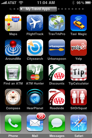
Remove two rows of blank pixels between each row of app icons, slide the horizontal row of dots that indicate which of the myriad pages you are on up to the top and add a user-modifiable label to the current dot, thereby labeling the currently-displayed page. Sliding the label left or right will rapidly flip pages, with the current label temporarily mirrored large and centered on the display so the user can see what page they are going to be landing on. (Recall they are covering the labelled button with their finger.) Or, hold the label for a second and it will open as a fall-down, enabling the user to directly touch the label for the page of their choice.

Springboard Page with Draggable Label
Apple could initially show no labels at all so that the new user would encounter no added complexity. When the user has entered edit mode by holding down an icon until they all begin to wiggle, allow the user to enter/change the current page's label. Easier, batch editing might take place in the iTunes editor on the user’s Mac or PC. This editing could include a table of suggested labels that would mirror the categories in the app store.
Right now, you can scroll horizontally to move among pages. Users should be able to scroll vertically within pages. I have many more apps that touch on travel, for example, than can fit on a single Springboard page. Vertical scrolling will enable me to access two, three, four, or even more screenfulls of those apps.
There are lots more apps I would like to buy, apps that add only limited value to my life. I no longer even consider them because there’s nowhere to put them. For example, I travel to London at least a couple times per year. I’d like several apps pertaining just to London, including maps, subway schedules, etc. No can do. Nowhere to put them.
Vertical scroll would set off a "silver rush," as people bought all the apps they now want, but that aren’t so good as to displace the "gold" ones they already have. It would also enable many of us, for the first time, to use the Safari "Add to Home Screen" feature to create fast website shortcuts.

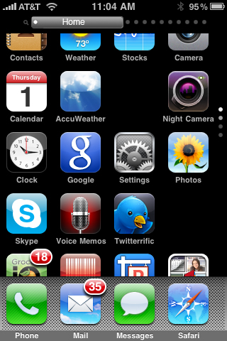
Springboard Home Page in Mid-Scroll
Vertical scrolling would not move page-at-a-time the way horizontal scrolling does. Users, instead, could scroll row-by-row. They could also "throw" the page vertically and have the window scroll down rapidly, in the manner of the address book. Only when the window begins to come to a stop would it gain hysteresis and lock to a break in the icons, rather than midway across an icon. (The illustration, above, shows the appearance during movement, not at rest.)
The suggested vertical-position dots, based on Apple's horizontal-position dots, enable the user to tell at a glance how many screenfuls of icons there are and where in that long page they currently are. Note that the top dot is a little over 3/4 lit and the second dot is a little under 1/4 lit, with the remaining two at neutral, indicating that we have just begun scrolling the first row.
Instead of copying the highly-flexible Mac Desktop, Springboard inadvertently ended up copying the Windows 95 Desktop, with icons auto-positioning themselves ever-upward, ever-leftward.
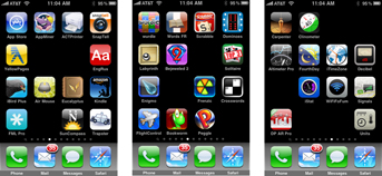
Users should be able to place icons anywhere they want with intervening spaces as they wish. Such spaces act as big cues to let people know if they have hit the right page or not. They give differing pages an instantly-recognizable “look.” Forcing every page to look much like every other page, as the current scheme does, increases error and slows users down.

Each page, even viewed in this reduced size,
has an immediately obvious, unique "look"
The current scheme also prevents users from clustering apps, making searches within a page difficult as well.
With the new iTunes Springboard editor already in place, by adding vertical scrolling with its increased space for icons, there will no longer any reason for forcing icons into being scrunched up against one another.
(Icons should still snap to grid. That is still a good thing.)
Springboard needs to introduce Containers, whether they look, in their closed appearance, like traditional folders or bear some other appearance. Touching one might open it up as a slightly-offset window that would overlay the screen behind it. Within would be a maximum of sixteen icons visible, plus the ability to scroll. Such containers would also offer a list view, for document storage, etc.
What would you use such a container for? Documents, certainly, and, if not Gold or Silver apps, perhaps your Aluminum apps, to abuse my earlier metaphor.
A couple of examples from an actual power-user—myself. My wife and I travel more than half the year. If we only went to London and New York, our scrolling Springboard Travel page would do the trick, but we don’t: We visit dozens of cities, and I’d like to have one or more apps covering some aspect of each of those cities. I want to have a container for each city containing tour guides, subway info, web bookmarks for favorite restaurants, etc.
I have also discovered I have a thing for compasses and compass-supported apps. Not only do I have the Apple Compass, I have a sun compass, a vertical ball compass, Huckleberry, a compass superimposed on a camera view, and the coolest compass-dependent app ever, DishPointer AR, used for finding a spot with a clear view of the sky for satellite TV and Internet antenna placement. (Check out the YouTube of it here.) I’ve recently had to dump some of my favorite compasses because there was nowhere to put them. Give me a compass container!
"But wait!" you say, "you're not a typical user any more than Steve Jobs is!" True, I'm on the other end of the bell-shaped curve, the end that buys buckets of apps. I not only take great pleasure in supporting my local independent developer, I'm also a leading indicator: I ran out of app room months ago. That means a lot of other free-spenders are getting really close, if they are not there already, and we free-spenders—"mooches" in sales parlance—are not the customers you want to shut out.
Even people who don't vacuum up every app that comes along could benefit from containers, however. Consider all the highly-aluminum apps like a little heart that auto-dials your sweetheart or another that calls 911. Such clusters of apps could all be placed in a single container that would replace your phone app now, giving you really rapid access (see my article on Fitts' Law) to the numbers you call most. Of course, your phone app would be in there, too, for all the other people you need to call.
(That particular class of app would also be many-fold more useful if users were permitted to change the names of their apps. I could buy one auto-dial widget and clone it, with each clone having a unique name and phone number. Ability-to-rename would also solve the problem of the AAA app being called "Roadside," discussed earlier.)
Finally, Springboard should allow me to have the same app appear in multiple places. The added complexity the first four changes represent to the user’s environment will create the same need for aliases as exist on Macs or Shortcuts on the PC. They should, however, all be first-class links to the underlying app, rather than one "real" app with multiple aliases. The user would have the power, in iTunes, to remove the app and all its pointers simultaneously. On the iPhone, each pointer could be removed individually, with the last causing a dialog to appear announcing that removal of the last will also remove the app. Alias creation might take place within the Springboard app or might, particularly initially, be limited to the iTunes editor.
I've offered the example of different containers for different cities to which I travel. Some apps go beyond covering a single city, spanning an entire country or the whole world. I may want to place aliases to those apps in many different containers so that, for example, everything I use for London, whether London-specific or more general-purpose, is in the London container, all available with a single icon-touch.
All of these changes work within the current Springboard metaphor and should not present any insurmountable programming challenges. Certainly vertical scroll is most critical and should be implemented within the next couple of months if sales are not to be further limited. The rest can follow.
These changes are also designed so that the new user or disinterested user will enjoy the same Springboard experience as today, while the "power-buyer" can regain control of their device.
Because iPhone/iPod Touch apps, at least at this point, all work one-at-a-time, adding ten or even twenty times as many apps to an iPhone/iPod Touch should have no effect on its reliability, etc.
The only effect of these changes will be that both Apple and its developers make a whole bunch more money and that users will be having a whole bunch more fun, making their personal Hitchhiker’s Guide to the Galaxy that much more beloved and indispensable.
This is not an exhaustive list of things badly needed on the iPhone. A number of readers have raised the need for tags. This is something that Apple has already indicated it is working on, at least for Springboard. Tags are needed badly to make the Search function on the iPhone actually work and could act as an alternative to links within Springboard itself. Their support is needed even more for photos and songs. Try finding one of thousands of songs or tens of thousands of photos on an iPhone and you'll immediately recognize the problem.
Join my intensive (and fun!) lecture/ workshop course. Sign up now!Interaction Design course: Go from zero to interaction designer in just three days. User Experience Conference Website There's more than my course at an NN/g conference. You'll find a breadth of other specialized courses and networking opportunities that will put you and your company at the leading edge of the design curve. |
|
|
Have a comment about this article? Start or join a discussion on your favorite forum.
Previous AskTog Columns >
|
Don't miss the next action-packed column! Receive a brief notice when new columns are posted by sending a blank email to asktoglist-subscribe@yahoogroups.com. |
| Contact Us: Bruce Tognazzini Copyright Bruce Tognazzini. All Rights Reserved |