| |||||||||||||||||||||
| |||||||||||||||||||||
Menu Fitts
One of your Fitts' Law questions was, “What can you do to linear popup menus to better balance access time for all items?”
One thing I noticed early on about Windows 95’s start menu is that it always aligns either the top or the bottom of the next heirarchical level with the item you came from (unless the menu is just to big). [Try this on your own Windows machine to see the effect.]
Installing a new program (which will add an entry to the menu) can all of a sudden switch your menu from being top aligned to being bottom aligned, which wreaks havoc with motor memory.
I always thought that they should at least pop up the next level menu so that it is middle-aligned if possible. This immediately drops the average time to all entries in that menu, and really reduces the motor-memory problems from going from top-aligned to bottom-aligned all of a sudden.
Of course, allowing orderings other than alphabetical would help too.
Cheers,
Adam Vandenberg.
I've always thought that having hierarchical menus jump around the screen sort of willy-nilly was a bad idea. Of course, it is difficult to get away from having such menus jump to the left, rather than the right, when there isn't enough screen real estate on the right to display them. However, it makes the programmer look stupid to have the arrows still pointing to the right, when the menu will be showing up on the left. The arrow direction should change dynamically to show the user where the menu will appear.
As for vertical orientation, Adam is correct in his assertion that coming into the middle of the menu affords a significant Fitts' Law advantage. That advantage can be built upon by making the vertical size of items away from the center be taller than those in the center. Recall that Fitts predicts the time to the target is a function of the size of the target. Such "Fittsized" menus show significant advantage in access time. (Walker, Neff and Smelcer, John (1990). "A Comparison of Selection Time from Walking and Bar Menus." Proceedings of CHI’90, Addison-Wesley, Reading, Mass., pp. 221-225.)
One comment on Question 3 of A Quiz Designed to Give You Fitts (The five fastest single pixels to hit on the screen): The order of these pixels was the only question I wasn’t even close on. After thinking about it more, I realized that the two pointing devices I use are a trackball and a track-pad.
The thing they have in common is that they are both driven with just my index finger (sometimes the middle and ring fingers help) the way I drive ‘em, rather than with my wrist and arm. I’m not sure what corners are actually fastest for me to hit, but after years of driving a Mac with a trackball, the top-left feels significantly faster than the top-right and bottom-left, both of which feel faster than the bottom-right.
I think this is due to the way I position my hand over the trackball. When moving my hand to the trackball from the keyboard, I hit it with the fingertip of my hand almost directly on top of the ball. Going up and either left or right means straightening the finger. (Upper-left seems to be a function of the middle finger with the index dragging a bit to get the leftward movement, in spite of moving my fingers in a relatively straight direction. Upper-right is the index finger, with the middle finger dragging.)
Pulling downward with the trackball, on the other hand, means curling up the fingers to the point that after about a half-screen of movement, the only part of my finger still on the trackball is the fingernail, which loses traction, so I have to either re-grab the trackball or start out by moving my fingers before starting to spin the ball. Analogous to running out of mouse-pad and having to readjust.
DaveP
Pointing devices all have their own characteristics. Usually, we just think of them in terms of overall efficiency. Dave has pointed out a case where the efficiencies are reversed, with the mouse having one strength, and the trackball another.
An ideal testing program will discover and report these differences, so that a design team can plan for and respond to them. Such a program is something rare indeed, however. In the main, the best we can do is plan for varying levels of pointer speed and coordination, without dwelling on the specifics. In general, any pointing device other than a mouse will "discoordinate" and slow down your users. Any pointing device that depends on small motor control will have even more profound effects. It is a good idea to test your software with at least one alternative device, preferably a really bad one, such as a stroke pad or small-ball track ball, to ensure that you are not overly depending on the mouse.
This will have the benefit of also simulating a person with limited motor skills using a mouse, thereby giving you a feel for the experience of partially-handicapped people.
I know what I've just penned will be distressing to the alternative-pointing-device subculture, but I ask that you take the following test before deriding me: Move this image into a graphics program and have an experienced mouse user trace a path from the black dot to the white dot without ever going outside the lines defining the pathway. Then you do it with your super turbo-powered feeblezeetzer mouse substitute. See whose time is faster.
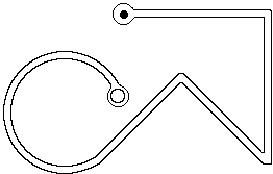
I've done this specific test, under controlled conditions, with seven different pointing devices. Only one I/O system took less time than the mouse—pencil and paper. A good graphics tablet should be able to beat the mouse, although the one I used fell considerably short due to latency and an excessively slippery tablet surface. All other devices, including track balls, were at least twice as slow.
Re: your Fitts' Law column
I know of some studies on Fitts’s law to determine performance with a graphical user interface using a mouse. I’ve yet to see one that tries to measure performance using a “dirty mouse”. You know the stuff that gets in around the mouse ball and the rollers and makes the movement sticky? Now, that might not be a problem if your desktop is reasonably clean, you think - just clean the mouse.
Now, think of an environment which is unclean, constantly so. I was teaching for 3 years in Papua New Guinea and we were constantly plagued with user problems due to the fact they didn’t have enough control over a mouse that was gunked up with dust, dirt, mold etc. Cleaning them was a constant task. Novice users got very frustrated at not being able to do what they wanted to do and the graphical user interfaces forced a high precision requirement. For example, it was enormously difficult to select options from hierarchical menus under Windows.
Now two questions: do you know of any studies showing degraded human performance using a “motion-challenged” mouse - one that by nature of its condition cannot be used for precision tasks? Or, do you know of any designs that prevent the mouse mechanism from becoming gunked up (Honeywell manufacture an opti-mechanical mouse, Sun have or used to have an optical mouse pad). Why are we stuck with the ball and roller mechanism?
Regards,
Stewart Fleming
This is yet another example of the things most of us fail to consider when designing hardware and software. Yet another good reason for always offering a complete keyboard interface in parallel with a pointer interface. (However, this is not an excuse for putting all your resources into the keyboard interface, then giving lip-service to the mouse interface. In almost every instance, if the keyboard interface is superior, particularly for editing, you have failed to provide a quality mouse interface.)
As for mice being the way they are, it is purely economics. That's what the mouse factories are geared up to deliver.
I hope a few of the good folks making bad trackballs might be listening. Instead of spending an inordinate amount of money trying to con people into buying what are provably inferior products, why not cast a little toward making aftermarket mice that stay clean? That could be marketed to anyone, since sticky balls are a problem we all must face as our rodentiometers grow old.
Text: the long and short of it
Is there a reason that you choose to make your pages incredibly long with basically just text. Doesn’t this seem to break some sort of rule?
-Steven Pemberton
Um, I guess it seems better than making them incredibly wide.
Our studies at Healtheon have shown that long pages, rather than myriad tiny pages, are better. Clearly, the world needs better text presentation mechanisms, but what we seem to have available are crude browsers and defective PDF viewers (see below). Not much of a choice.
Well, that’s my feeling too, but not Jakob Nielsen’s:
Top Ten Mistakes in Web Design 6: Long Scrolling Pages
Only 10% of users scroll beyond the information that is visible on the screen when a page comes up. All critical content and navigation options should be on the top part of the page.Best wishes,
-Steven Pemberton
Harumph! Why is it always Jakob? The man is a perpetual thorn in my side.
Here's what the good Doctor Nielsen would have wanted to say, if only he'd thought it through:
Web pages tend to suffer from an illusion of completeness that leads users to believe they are seeing all the content available to them. You must assume that, on the front page of your website, anything appearing "below the fold" may never be visited.
If you want to use long, scrolling pages on a site that is visited once or once in a while, you will have to take specific steps on long pages to keep people from skipping out early, in the belief they have seen everything there is to see. The techniques for doing this are covered in "Silo Design for Web Transactions."
While I try to keep the important stuff "above the fold" on the AskTog home page, I do use long scrolling pages for articles. The illusion of completeness tends to kick in when a page has several discrete chunks of information. When one chunk ends just about where the window ends, people assume that is all and move on. On the other hand, when an article is just getting to the good part and the window bottom is reached, users are likely to look around for the rest of the article. At some point in this process, they are likely to discover the scroll bar.
Ironically, this page, with its relatively short-winded answers, has more of a chance of causing confusion than most of my longer articles. However, I also depend on the intelligence and experience of my particular audience. If you folks can't figure out that that funny lookin' thing just to the right there is a scroll bar, who can?
As for why I use scrolling, it is far, far "cheaper," time-wise, to fetch one long page across the web than to fetch a whole bunch of short ones. And besides, it has been wrung out pretty well, being the dominant form for written documents up until a few centuries ago when the sheet-fed printing press was invented.
Jakob also recommends that we keep our writing short when composing for the web. I'm guilty of walking all over that one. My apologies.
Hello,
I’ve just read your article, "The Polite Interface or Guidelines for Dialogs," in which you suggest using red and green blinking icons to indicate failure or success of some action.
I used something similar in one of my programs. One of the users pointed out that it was confusing to people suffering from colour blindness as some of them see red instead of green and green instead of red.
Some other kind of indicator is needed. Maybe a tick or a cross?
Gowan Clews
People seem to pass through three stages in their understanding of color blindness as applied to software design:
Even though I try to hover somewhere around stage 2.5, I've slipped into stage three recently. You know you are in stage three, because the folks that haven't reached stage two yet tell you so. Loudly. In meetings with your manager present, as in, "Well, Mr. High and Mighty Know-It-All Interface Guru, perhaps you haven't found out yet, but some people can't see your precious red and green on account of they're color blind...."
Gowan, on the other hand, has shown remarkable tact in the face of my faux pas.
Yes, any time you use color to convey information in the interface, you should also use clear, secondary cues to convey the information to those who won't be experiencing any color coding today. Secondary cues can consist of anything from the subtlety of gray scale differentiation to having a different graphic or different text label associated with each color presented.
The cones in the eye are the source of color vision. We have cones separately sensitive to red, green, and blue. If the red ones are not functioning that is called protonopia. If the green are not functioning, that is called deuteranopia. Absence of blue, extremely rare, is called tritanopia. When all fail, the world is seen on a black and white TV.
Protonopia and deuteranopia are the most popular forms of color blindness, collectively called red/green blindness. (Significant differences, in fact, exist in their effects, but those differences have no real effect on design.) While tritanopia is far more rare, it nonetheless rules out dependence on yellow-blue differentiation without secondary cues.
People suffering from any of these conditions don't experience the wrong color, they experience an absence of color. However, people will sometimes confabulate colors:
The headmaster of my high school, who was red/green afflicted, once gave me a royal chewing out for having a red light in my room, such lights being banned as reflective of a certain kind of establishment that teenage boys often gravitate towards, at least in their fantasy life. I had to call in witnesses to testify that mine was a bug light—a bright yellow bug light. So one of the less appreciated effects of color blindness is that such people, in their effort to make up for their perceptual loss, will ascribe redness or greeness to an object that, in fact, demonstrates neither.
The headmaster, by the way, had been excused from the draft in WWII because of his terrible affliction, right up until the day the English discovered that color blind people could see right through camouflage. The next day he and every other color blind lad in England were drafted and made forward flight observers.
Color blindness, like baldness, is inherited from your mom. If you are colorblind and are going bald, too, you may want to rethink that Mother's Day card you were thinking of investing in. Your only comfort may be in knowing that she may be color blind too: 1 in 200 women are.
Togism is good. I’ve believed in Togism for about a decade and it has greatly improved my serenity of being.
Reading this stuff on screen stinks. Printing it out from the screen version is crummy. Give us print-targeted .pdfs, or we’ll give you our migraines!
Tzvi Freeman
I must first reveal my personal bias in this discussion, since I worship at the First Church of PDF Really Sucks.
Not that there is anything wrong with it that competent programming and a sincere desire to create a universal standard couldn't have fixed. It is just that both have been sorely lacking.
PDF works 50% of the time. The rest of the time, it doesn't. While this is only my personal experience, that hardly makes for a universal standard. My penultimate problem was that it decided it absolutely, positively must have some file in the system folder that begins with a tilde. (Files that begin with a tilde have never struck me as particularly user-friendly anyhow.) So if Mr. Universality wants the file there, let it put it there! I don't know where the hell it is.
The final problem was a bit more serious. I launched Acrobat and, halfway through the boot process, it eliminated all the contents of a 2 gigabyte hard disk.
I once spent 18 months with Acrobat telling me I had to upgrade my version of some other silly Adobe product or Acrobat would refuse to open. I upgraded the product no fewer than five times. Acrobat still refused to open.
If Adobe were more interested in creating a universal, a.k.a., open standard, than they were in making a quick buck, the PDF technology would simply be a part of the major operating systems, instead of being this overblown adjunct.
I'll stick with the real open standard, HTML, in the hopes that some day the HTML folks will get a clue and support those of us who need WYSIWYG correspondence between screen and print. At least when they do, it will be a true open standard.
In the meantime, forward me your migraines. Since I eliminated Acrobat from my computers, I haven't had nearly enough.
Linux & other highly-customizable interfaces
Tog,
Earlier today I finished reading your two wonderful books, Tog on Interface and Tog on Software Design. Later, As I sat in front of my PC perusing my email I started contemplating the very unusual, blobby window in the corner of my screen. It belongs to the application sonique, an mp3 player, and it reminds me of a tool from Kai’s Power Tools. I find its interface very annoying, but slightly less so than its competitor, WinAmp. One of WinAmp’s claims to fame is that it is “skinable,” that is, it’s interface is easily customizable and dozens and dozens of different designs exist for this media player.
My question is: are you familiar with these tools and their unusual heavily customizable interfaces? And, if so, what are your thoughts on such interface designs? Also, with Linux growing in popularity, X-Windows is also becoming more widespread. What do you think of X’s various Windows Managers and their nearly infinite customizability—an interesting environment to experiment in or death-by-a-thousand-cuts?
Thanks,
Dan Dulay
Well, Dan, having just completed my two wonderful books, you should know how much I approve of spurious variations in the interface, particularly when such variations are in the hands of people who historically have absolutely no talent in the area of design.
You may therefore be somewhat surprised that I am at least passively supportive of WinAmp. Beyond the fact that I like any application that tends to rub the greedy entertainment industry's nose in the dirt, I see WinAmp and its Macintosh brother, MacAmp as simple, lighthearted pieces of fluff that exists solely for making people happy. I've never seen a variation of these two products that would in any way confuse me. Some delight me and some, due to their "advanced" color schemes, make me want to throw up, but all are familiar and usable.
Linux, on the other hand, is a double disaster. It is a disaster, first, because having two major windowing systems, each with infinite customizability, in a system designed for building major mission-critical applications is just stupid. Second, it is a disaster because the Linux community is blissfully unaware that there is even a problem.
And don't bother writing me, you Linux people out there. I know exactly how you think. ("I don't have any problem with 13 different interfaces; why should anyone else?")
What's more, don't even worry about it! You are appealing to the one remaining pocket of customers who wouldn't know a good human interface if they fell over it. If they haven't figured out how many billions of dollars in lost user-productivity bad UNIX interfaces have cost them, how likely are they to figure out how much Linux intends to drain from their corporate coffers through inept design?
-tog
I’ve found the Apple menu system to occasionally be a hindrance to learning. A friend, a Mac owner, often fails to notice which application is in the foreground. Because the menus are decoupled from the application to which they correspond, the persistent menus (like File and Edit) often fail to contain what she expects because she’s looking at another application’s menu items. This is particularly problematic because she relies on menus for almost everything. A step worse: the foreground application may not have any windows visible, suggesting that the Finder is the foremost application.
Personally, I find most pull-down menus to be an abomination, and I do as much as possible with keyboard triggers. I need no hand-eye coordination to activate most of the useful keys on my keyboard, and that’s fine with me. Fortunately, I have great memory for keyboard shortcuts. I cry for the folks who use pull down menus to save a document when they could use a persistent keyboard shortcut to get the same result.
Sorry. Didn’t mean to rant there. Just another opinion.
Scott Ventura
Rant away! That's what we're here for.
The problems your friend is facing are caused not by the position of the menus, but the design of the interface. The original interface was designed for single-application use. It wasn't until several years after the introduction of the Macintosh that "multifinder," enabling the illusion of several simultaneous applications on the same desktop appeared.
(Actually, I was in the room the day folks at Apple first saw it. A trio of young hackers from Berkeley had hitchhiked down to Apple, some 40 miles distant, to demo some new software they had been working on. The started up the Mac, showing the Finder, then launched MacWrite. MacWrite opened up with a new, full-screen document, as it always did. They typed a few lines, then grabbed the mouse and headed for the size box, down at the corner of the window. When they shrank the window back, the finder, with all its files and folders, was revealed beneath. We were totally blown away. Totally. Before they left, a deal had been struck, and they rode home in a stretch limo.)
Memory was still scarce enough that people still had only one or two applications in at a time, plus the Finder, and little confusion arose. Today, however, people often end up with ten or fifteen open applications at once. As a result, Apple now shows the full name of the active application in the title bar, just to avoid the kind of confusion that you suggested.
Unfortunately, they are showing it on the right side of the menu, which proves to be the wrong place. It should show on the left side of the menu, either beside the Apple icon, used for the Apple menu, or, even better, in place of the Apple icon. (Few people become suddenly confused as to what computer they are using, although I'm sure there are exceptions.)
I guess the lesson to be learned here, yet again, is the importance of rethinking the whole design when problems come up, instead of just "tacking on" a patch to some random place in an existing design.
As for your own love of keyboard shortcuts, Scott, it sounds as if you are a Windows user. My condolences. Windows pop-ups are brain-damaged in so many ways that it is a wonder that anyone uses them.
How's that for ranting?
As a WebTV user/college student , I just lost access to my county library card catalog website (DRA Web2). Having no access to WolfCat and with WebCat already having removed 2 colleges (including my own!) and the city library, I am now left with 1 local state university card catalog using WebLUIS, and am madder than hell. I am a loose cannon pointed in the directions of DRA, SIRSI, and WebTV. I would like to learn more of what can be done without the burden of adding a PC.
Without blaming, it appears WebTV does not test, nor do the sitemongers, and the library finds out after the hostility is in place. Z39.50 etc. appears to be smoke, and attitudes and finger printing is rife. Advice?
I am a new peruser linked from Alertbox.Thanks.
Jon
Few sites will ever test for webTV compatibility. The audience is too small, and the problems of supporting users with pre-1980s screen resolution are too great.
The promise of webTV has always been greater than any possible delivery. You are paying the full monthly price for a service that is inherently crippled.
It will get better: With the advent of HDTV at popular prices, monitors with normal computer resolution will, finally, be universally available, but that is still several years off. Only then will the real promise of TV-Computer integration come true. That promise, however, is not webTV with a better screen. That promise is a PC with tight television integration.
My only advice for the short term is that you accept the "burden" of adding a PC. In truth, you will never achieve more than amateur standing with a modified TV.
You can get a clunky old Windows box for under $500 and spend a few weeks figuring out why it won't connect. Or you can get an iMac and be online—really online—15 minutes later. Your choice. In either case, you'll be spending the same amount per month to be online, but you will have true, full access to the web.
On the horizon are a whole bunch of handheld devices that will soon be tying into the net. I predict we will be seeing a large number of websites springing up to support them. Should they prove ubiquitous, it may well be that someday most websites will have to support them. If so, site creationg/management programs will need to offer the capability of "spinning off" alternative pages for miniature-screen users.
Dear Tog,
While in general you are correct that ESPPs are very good investments, there are times when this is not the case. Sadly, I’m all to familiar with the less-rosy situation.
Take a company, call it Vorland, that is not doing so well. While the stock price had been in the high 90s, it has been on a steady decline since. You choose to invest in the ESPP because it is such a good deal, but as the months go by, it is obvious that the “low” from which you will be buying is going to be the last possible date, i.e. the price you get is the current price, minus 15%. Now here comes the problem: Vorland doesn’t let you take possession of the stock as soon as the stock is purchased. Instead there is a delay, a week, two weeks, perhaps longer. When I was in the plan, due to “financial irregularities” with the company, the delay was 6 weeks. During that time, the stock continued its slow but steady fall and by the time I actually had some stock to sell, it was selling for a price far lower than the price for which it was purchased. Note that the company stock never recovered.
Bottom line: you can lose money on ESPPs when there is a delay between the time of sale by the company, and the time you actually take possession of the stock. Check this carefully.
yours,
Colin Glassey
Teleologic Web Design
Dear Tog,
I must sadly point out the problems with your overly enthusiastic comments about ESPP plans. I personally have lived through these plans going sour. First, ESPP plans are “guaranteed” if your company meets at least one of the following criteria:
- 1. Stock price is climbing and can be expected to continue doing so.
- 2. You are allowed to make a same day sale on the purchase of the stock, thus taking immediate advantage of the 15% discount.
The problem with ESPP plans, and this according to a businessman I know well, is that they provide no incentive to stay. Since you can sell the stock you purchase immediately, this plan does not meet the goals of the “incentive stock option”, which exist to encourage the employee to stay and help grow shareholder value. As such the 15% discount usually shows up on the individuals W2 as a CASH bonus. This can still be a wonderful thing if the executives of the company view it as a way to give bonuses to the employees.
If, however, your company isn’t doing so well, then the ESPP hurts the employer by dumping stock from reserve every six months onto the market, diluting the stock. As such, an employer can then prevent the employee from selling the stocks bought in his/her name by putting the whole company under an insider trading “blackout”.
The worst case scenario, and the most cynical, is that an employer may put the company under a blackout, but still have ESPP shares purchased in each employees name in an attempt to drive up share price. If the share price is still declining due to the news being released, then an employee may find him/herself looking at purchasing shares against their will that they can’t sell until the price has declined further, thus loosing money on a “guaranteed” return. Don’t laugh, a number of my compatriots and I have just lived through this and even been berated by our new upper management for expecting a “guaranteed” return, and for diluting the stock by attempting to sell it immediately (which is the only wise thing to do if the value is declining).
The moral of this story is that before signing up for an ESPP, check with upper management as to their take on the program. If they see it as a bonus system, then GO FOR IT. If they see it as a way to build stock value for the employee, or more importantly, for the employer, then stay away. Stock value for the employee is more safely accrued via traditional stock option plans.
Sign me
BURNED by changing ESPP goals!
Colin's and Burned's advice is very well taken.
I had had no previous experience with companies that did not allow same-day sales and, in fact, assumed that the government, in their wisdom, had regulations against this kind of chicanery. Now how stupid was that?
As soon as I received their mail, I added to the original column a new section: "When Good Companies do Really, Really Bad Things," specifying the problem and adding the steps you should take to protect yourself.
ESPP remains the deal of the century, as long as you approach it with some prudence.
-Tog
|
|
Don't miss the next action-packed column! Receive a brief notice when new columns are posted by sending a blank email to asktoglist-subscribe@yahoogroups.com. |
| Contact Us: Bruce Tognazzini Copyright Bruce Tognazzini. All Rights Reserved |