| ||||||||||||||||||||
| ||||||||||||||||||||
Maximizing Windows
click here for printer-friendly version
[This page is, of necessity, graphics-intensive. It may take a minute to finish loading. Please be patient.]
A design team must be prepared to go to any lengths--or depths--to achieve a successful product. Usually, that means a redesign or two. In constructing Healtheon's Benefit Central, for one apparently simple screen, it meant seven major design iterations.
Background
Healtheon/WebMD's Benefit Central enables people to select and sign up for employee benefits, such as medical and life insurance, over the web, using a standard web browser.
Many users only visit our site once a year. Benefit Central was to be designed for single-use, with a remarkably shallow learning curve.
We designers approached our new project with two unspoken assumptions, both of which would be proven wrong: First, that web-naive users, of all our users, would have the most problems using the application. Second, that users would face their greatest challenge in coming to grasp the ramifications of contingent beneficiary choices and the intricacies of flexible spending accounts.
We had no idea that a little throw-away screen we needed at the very beginning of the application would almost prove our, and our users', undoing.
We identified three classes of users, from which we selected test subjects: web-naive, having from two to ten hours total experience on the web; power-users, who use the web at least 20 hours per week; and those that lay between. Our goal was to have the application be safe and supportive for the naive, while not condescending to the experienced.
Too Many Choices
Problem
The default browser window proved too tempting to all users, offering them a minimum of 100 different action options. These options, while invaluable to the casual information browser, proved confusing or destructive when the browser was reoriented toward delivering a real application.
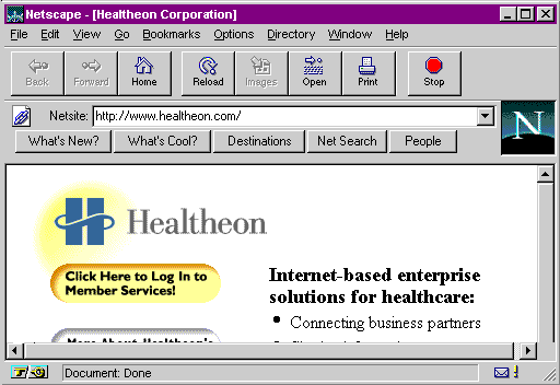
Particularly destructive were those options that would throw away the user's typed-in information without warning either to the application or the user, and those that would cause the window to disappear, either by whisking it off the screen or obscuring it beneath another window. No users proved able to recover from the former; web-naive users proved unable to recover from the latter.
We had to find a way to eliminate all these "attractive nuisances" so users would be guided into the options needed to successfully enroll.
Proposed Solution
While the browsers would not permit us to turn off options already visible in the current window, they would enable us to open a new window with all the options turned off, so that users would see only those options that were under our control and protection.
First Prototype of Member Services Opening Screen
Approach
A new window has been opened on the user's desktop, containing the first screen of member services.
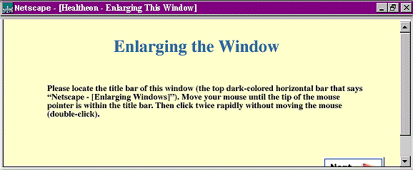
Solved problem
Emerging problems
The Illustrated Title Bar
Approach
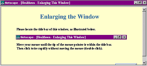
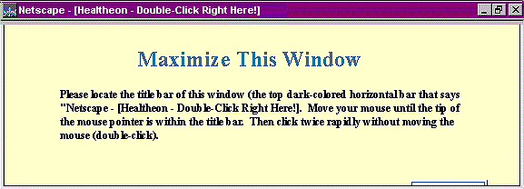
Since they can't seem to find the title bar, show it to them!
New Problem
They found the title bar. Or at least they thought they did. A high percentage of users repeatedly attempted to double-click the illustration, rather than the title bar itself. Back to the drawing board.
The Explicit Title Bar
Approach
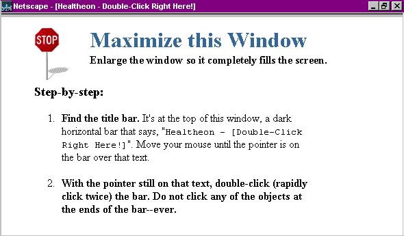
Explain the title bar again, but put instructions for what to do with it in the title bar itself. That way, users don't have to maintain two centers of attention. The instructions on the page explain how to find the title bar, and then the title bar itself takes over. The unusual wording within the title bar (Double-click right here!) would also help people find and fixate on the bar.
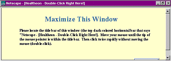
Solved problem
Naive users were able to maximize their windows!
Emerging problem
Power users weren't.
Power users ignored the instructions, scrolled far enough down to fully reveal the Next button, then left the page with the window tiny and off-center. They would then spend the next twenty minutes attempting to use the application with most of each page out of view.
No more scroll bars
Approach
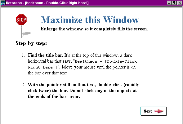
Remove the scroll bars.
Solved problem
Now both new users and power users were successfully enlarging the window.
Emerging problem
The power users were not happy. They didn't like the simplistic instructions. While they were successful, but they were not satisfied.
Separating What from How
Power users were quickly emerging throughout the application as "the other problem group." They were having just as many problems--and in most cases the same problems--as naive users. In the power users' case, it wasn't for lack of knowledge, but lack of patience. They would read nothing and would follow no instructions if they could possibly avoid it. They would demand "short cuts," then end up turning a five minute quick enrollment into a half-hour ordeal by leaping and crashing from place to place, while carefully side-stepping all advice or instruction.
Nonetheless, we felt a certain kinship to this recalcitrant ilk, being power users ourselves, so we decided to give them (us) a break when it came to all that tiresome text.
Approach
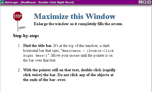
We separated instructions on what needed to be done from instructions on how to do it.
Problem Solved
Power users were far happier, even as new users continued to receive the information they needed to get the job done. Our job was done--or so we thought.
Wheezing windows
New Window? Or Old?
It was right about here that things began to get weird. Just when we finally had virtually all users, from naive to expert, getting through this exercise, we suddenly found a small, but determined, minority repeating the exercise--over and over and over. First they would maximize the window; then they would shrink it again; then they would maximize it; then they would shrink it again.
When a browser window changed from small to maximized, it did not do a graceful zoom. Instead, the window disappeared entirely, to be replaced by a new, larger window. Test subjects were developing one of two mental models to explain what happened:
In the latter case, users did the only logical thing: they read and performed the instructions on what they perceived as a new page. And the "new page" told them to double-click the title bar.
Unfortunately, there was nothing to be done. We had no power over the content of the window, since the application received no event when a browser window was changed in size.
The Chronic Complainer
When I got the first test report about people "wheezing" the windows, I knew I had already done the best I could. Whatever strange power pushed these individuals to perform their strange rite was going to have to keep pushing them. I resigned myself that a small subset of people--no more than fifteen to twenty percent, were going to sit there for around three or four minutes double-clicking on the same title bar over and over again.
Unfortunately, the usability professional who was performing the testing, Kivilcim Boztepe, was not so resigned. She absolutely insisted on reporting on these people in writing each and every week. I even took time out of my otherwise busy schedule to sit down with her and council her on the futility of reporting on problems beyond human intervention, but she completely ignored me! The very next report, there it was again: "Test subject 43 spent eight minutes and 37 seconds growing and shrinking the Maximize screen before finally moving on."
After around two months of Kivilcim's relentless haranguing, I finally came up with an idea. I didn't know whether or not it would work, but I was willing to do anything to just get Kivilcim off my back. And thus, Parker was born...
Parker the Prairie Dog
Approach
The human vision system is specialized to pick up movement in the periphery, this to avoid being eaten by lions, tigers, and bears. Because of this phenomenon, peripheral animation is normally avoided at all costs in software design. Here, however, it appeared eminently qualified to assist.
 |
||
 |
 |
 |
We added the animated Prairie Dog to the bottom of the page, hidden from view until the maximizing took place. Once he appeared, Parker directed user's eyes to his message, telling them that they were done, and it was now time to move on.
Result
The number of people repeatedly growing and shrinking the window dropped markedly. However, it didn't drop far enough. Even with Parker's best effort, a few hold-outs continued to cycle the window.
Parker the Permissive Prairie Dog
The Problem
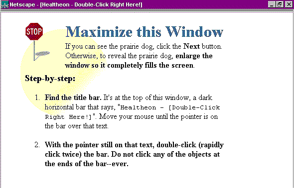
We questioned the test subjects, asking them in the kindest possible way why they were being so stupid. It turned out they weren't. Exactly. It appears that some people take to heart their first grade teacher's admonition to "keep your eyes forward and pay attention to teacher." In this case, that translated to mean, "yes, there's something interesting going on down at the bottom of this new page, but we aren't there yet. Instead, start reading from the top, just as we've been taught." So, ignoring Parker, they would read "Step 1: Find the title bar...." and end up repeating the whole process all over again.
 |
||
 |
 |
 |
The Solution
We added a message at the top ("If you can see the prarie dog...") specifically giving this minority permission to look down at the bottom. The wheezing problem finally, and permanently, went away.
After Math
Actually, the math is really simple: Three days. That's how long after we finally had a successful design that Netscape announced Netscape 4.0, with the brand-new "Open a New Window Any Size and Location You Want!" feature, obviating the need for the Maximize page completely.
Not that our work was in vain. It would be a year or more before all our clients would move up to the new browser. Still, after so much effort, we would have preferred their leaving the problem around for at least another year.
Don't miss the next action-packed column!
Receive a brief notice when new columns are posted by sending a blank email to asktoglist-subscribe@yahoogroups.com.
![]()
Contact Us: Bruce Tognazzini
Copyright Bruce Tognazzini. All Rights Reserved