| |||||||||||||||||||||
| |||||||||||||||||||||
Dear Tog,
A colleague of mine needs to deliver a transaction-based system using HTML over the web. The problem (as you might imagine) is that the interaction model needs to be based around user tasks to be completed, rather than pages to be browsed. Each task needs to be completed or abandoned (can't just type in a new URL in the middle of a task and shoot off), and the task cannot easily be constrained to one page. In short, he needs to radically shift paradigms for his users.
Elizabeth Buie mentioned that you are working on a similar problem. Do you have any design insights you would be willing to share?
Janet Borggren
janet.r.borggren@ac.com
The secret to transactional design using current web browsers is taking control. While this is anathema to the current web philosophy of barely-contained anarchy, it is essential if a transaction system is to be successful.
When we developed our benefits-enrollment product at Healtheon, we identified three classes of users: naive, experienced, and power users. Naive test subjects had to have used the web a minimum of two hours--it was not our goal to test whether they could start up their system, only to test how well they could use the software. Experienced test subjects spent a couple hours per week on the web, and power-users spent more than that and self-identifed as power users.
From the beginning, it was clear we were going to have significant difficulties with two of these groups. Naive users needed guidance to avoid wandering off accidentally, and power-users, who insisted on exercising their right to get lost if they wanted.
Had I been designing a service that people used voluntarily on their own time, I might have left the power users alone--after all, I enjoy my right to get lost, too. However, this was a serious service, and failing to achieve a successful enrollment could have serious financial and legal results. Something had to be done to guide--and control--the users.
The first step was to get rid of the "attractive nuisances," the plethora of tempting menus, buttons, and controls, all of which had nothing to do with our application. Having the browser's controls surrounding your tranactional application is rather like having the menu bar for Photoshop perched on top of Excell.
This exercise is critical. Browsers don't tell you when users have clicked the browser's own buttons. You have no opportunity to save users' work or even inform them that their work will be lost. Our adventures in getting rid of these controls is chronicled in excruciating detail in Maximizing Windows.
Having rid ourselves of the browser's controls, we then experimented with our own. Desirous of giving power users as much freedom as possible, we placed our own menu button bar at the top of each page, with buttons to jump to various places in the enrollment process. Big mistake. Power users of a once-a-year application don't know where they want to jump. What's more, they don't know when they are free to jump.
The first screenful of a web page--or any other foreign document--tends to look complete. Unless the screen happens to break across some graphical element or divides a line of text in two, users will assume they have seen it all and will move on.
The only consistent information users are getting on the real size of the web page comes from the scroll bar, and, based on our testing, it is not even close to working.
For the first fifteen years of the personal computer, we spent the vast majority of our time composing our own documents. The work product of other people's computers arrived at our homes and offices printed on tree carcass. The web changed all that. What needed to change with it, but hasn't, are the scroll bars. We used to depend on our own knowledge to understand how large a document was. Now we must depend on our scroll bars, and they are not up to the task. It was bad enough when the bars had clear "elevators" in black, sliding on a clearly-contrasting background. On Windows, in particular, they seem to have taken some pains to make the elevator disappear entirely. Medium-gray on medium gray is not the ideal choice for contrast.
The result is that test subjects would reach a page of ten benefits--medical, dental, vision, life insurance, etc.--and leave satisfied that they had enrolled, completely oblivious to the fact that all they had chosen was a single medical plan.
We tried every device under the sun to increase user-awareness of page size, but nothing worked. We finally determined we had to remove our own button bar from the top of each window.
Yes, we did try bringing up dialog boxes when power users would (inevitably) press these buttons, explaining in detail the importance of finishing the first task before doing the sixth. We discovered that power users don't listen very well. They uniformly ignored options and choices that would have slashed their enrollment time, just to be able to do what appeared to be an immediately satisfying jump. They were consistently taking one and a half to two times as long to complete an enrollment as the experienced user cohort. We had to reign them in.
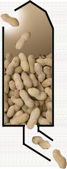
Silo Web Pages |
The solution to the problems of naive and power users alike was to bring people in at the top of a page and not let them out until they reached the bottom. Very much like the giant wheat and peanut silos (I didn't have any pictures of wheat) of the American Midwest, the users go in the top, and they aren't leaving until they reach the bottom.
Each page had Back and Submit buttons at the bottom and, below that, the power users' treasured button bar. The naive users loved it. They were gently guided from task to task, receiving all the navigational support they needed. Experienced users likewise felt unencumbered and worked through their enrollments with great success. Some power users complained, but very few. And even the ones that did were able to do something that earlier power-user test subjects could not. They were able to complete a successful enrollment in a short period of time. It was clear that, had we offered all the escape routes in the product, then taken them back, the power users would have been upset. By removing them before release, as a result of our testing, we avoided teaching these users what might have been. In summary
|
These techniques are overkill if all you are doing is getting someone's name and address. For lengthy and complex data collection, they are a necessity. Power users may get a bit ornery about having to scroll to the bottom of a page to move on, but it is nothing to their reaction to losing three pages worth of work.
Keep writing. The questions and comments have been good and they are getting better! Click now on...
Response
Just read Silo Design for Web Transactions. Some good points. Another one to add to the list is "never, ever, lose a person's info."
I've been advising my brother, who is putting together a small site (Why? To sell hats, of course.) and one trick he's relying on for the commerce part of things is that a person viewing the site can pop out of their current location in the site and go somewhere else without losing any of the information they've entered so far. If they forget that they need a hat for Aunt Sadie in the middle of entering the gift card text for Cousin Jim, they can abandon the card, browse some more to find Aunt Sadie the perfect toque, all the while not losing the shipping info for Cousin Jim.
It requires a modicum of database smarts and a solid handle on how cookies/session IDs work, but it's an amazingly freeing design concept for a transaction/commerce site. (Making sure your site hierarchy is at most two layers deep helps, too!)Rick Levine
Sun Microsystems
Rick's bro is doing it right. Users should never lose their work, no matter how much work guaranteeing that causes us.
Web pages are stateless. When many folks read that back at the beginning of this revolution, they took it to mean that their sites could be stateless, no matter what kind of mischief it caused. What it really means is that we take on the obligation to construct by hand what those www guys left out. We have not been freed from an obligation to protect our users by maintaining state on our own.
-Tog
|
|
Don't miss the next action-packed column! Receive a brief notice when new columns are posted by sending a blank email to asktoglist-subscribe@yahoogroups.com. |
| Contact Us: Bruce Tognazzini Copyright Bruce Tognazzini. All Rights Reserved |