 |
||||||||||
| ||||||||||
| ||||||||||||||||||||||
AskTog, January, 2004
Download these four visual-interface add-ons and one abstract-interface add-on and try them free. If you choose to adopt them, you will have a desktop that can outperform not only a Dock-dependent Mac system, but also Windows XP and a fully decked-out System 9.0 computer.
(I have no affiliation with these developers. I have made no money, and I have sought no favors. I bought all these with my very own money. They cost me collectively less than a sushi lunch for two at our favorite Japanese restaurant.)
I’m indebted to Loren Miller and his excellent article on how to make OS X track the familiar OS 9 environment. My goal, however, was different: To make OS X as productive as possible regardless of whether add-ons track System 9 or not.
In fact, I gave extra points for add-ons that feature the new OS X look-and-feel. Nonetheless, four of the five add-ons I ended up adopting appear in his article.
Loren invented a new unit of OS 9-likeness, the Tog, to report his findings. All those I ended up adopting Loren gave a rating of at least
| 4.50 togs |
I would give them each a perfect five.
Unlike OS 9 add-ons, these will not leave your system a smoking ruin. The industrial-strength UNIX underpinnings of OS X ensure that such add-ons can integrate nicely without causing problems.
The visual-interface add-ons that Immediately follow collectively offer advantages over the Dock. First, they “offload” the hopelessly overloaded Dock, which just simply ends up with too many items in it when used in a high-productivity environment. Second, objects end up in a consistent, known location, so you don’t have to search for them. Third, they all maintain a visible text label.
Join my intensive (and fun!) lecture/ workshop course. Sign up now!Interaction Design course: Go from zero to interaction designer in just three days. User Experience Conference Website There's more than my course at an NN/g conference. You'll find a breadth of other specialized courses and networking opportunities that will put you and your company at the leading edge of the design curve. |
|
|
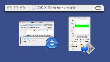
Three windowshaded windows. Top window was double-clicked to hide all but the title bar. Bottom two windows show contents + application icon. Windows are continuing to update their contents.
Analysis: Like WindowShade X, ASM offers stability, predictability, and unambiguous identification. Users have the option to display applications in the order of launch or alphabetical order. In the former case, stability is maximized. In the latter, predictability is maximized.
In OS X, the show/hide functions have been moved to the parent menu for the application (between the Apple Menu and File), which also contains Preferences and Quit. Show and Hide are not actually application-level commands. They belong at window-level. A basic tenet of the Mac has always been that the mode of machine should track the mode of the user.
Applications, in this case, are the mode. When users elect to show/hide applications, the user's mode is at the system-wide Finder level, looking down on the applications. Even when a user is electing to hide a different application to better view the windows from the current app, he or she has still moved mentally to a higher-level, system-wide mode. Looking inside the current application in order to hide other applications violates this principle. Even if the user's wish is to hide the current application, the only motivation for doing so would be to move to a different application or the Finder. Why else hide it? That indicates the user has already moved mentally beyond the current application, again suggesting the mechanism they are searching for should be at a different level.
It would be possible to integrate the application-switcher with the application's parent menu. However, since Apple has gone to wide, short windows, there's plenty of room for an application-switcher menu, so there's no need slow the switcher function down by putting it within, but below the other menu. It also has the advantage that the current application's name now appears at both ends of the menu bar, keeping users better aware of what application, what mode, they are in.
FruitMenu also turns System Preferences into a two-mode object. Click on it and the control panel will open in the usual way. Hold it down to reveal a submenu listing all the control panels in alphabetical order. With this action, you can avoid the still-lumbering startup of the master control panel and get right to your work.
FruitMenu needs improvements. You have to put a bit of work into it to get it to display the standard OS X menu items in their standard places, and even then you may fall slightly short. This is the correct place to start since OS X's locations are perfectly proper and there's no reason to purposely introduce an inconsistency.
It also offers a context menu editor which I’ve found of little value, perhaps because the documentation doesn’t explain what it is for or how to use it, two things which would seem to be the minimum requirement. It doesn’t offer a way to add to the Finder’s context menu those items unfortunately stripped away in the move from OS 9 to OS X, such as the ability to set a window’s View properties, the only area of add-ons I’ve found needed.
Analysis: Nothing is wrong with the OS X Apple menu, so FruitMenu is not correcting introduced problems. It just provides an efficient way to store traditional desk accessories, such as calculators, in a familiar location. This is a capability that I would imagine is on the OS X teams wish-list.
DragThing Dock tabs across window bottom
The drawer names are yours to give. Notice the larger size of the OS X Apps drawer. This is the drawer I use most often. I've padded the name with spaces to offer a bigger target, in keeping with Fitts' Law.
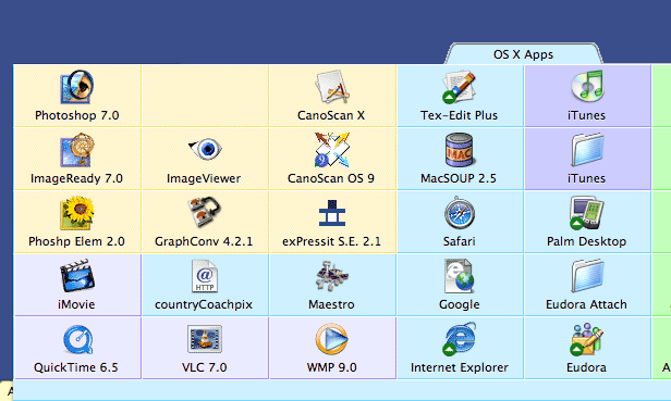
A Portion of an open DragThing Dock
You populate these drawers by dragging objects from anywhere on your system into the drawer. DragThing then creates inside the drawer, in effect, an alias to the original object. If you don’t want the object in the drawer anymore, trash it, and the alias only will disappear. Want to move it to the desktop? Drag it out of the drawer and it will appear in the Finder as a normal alias. Very easy; very slick.
I currently have 111 objects in my DragThing docks, and I can get to them faster than I can access one of the unlabeled, dancing objects in a well-populated OS X Dock. (Of course, I’ve arranged them according to Fitts’ Law, with the most often used objects directly below the tab label, so when the drawer opens, the mouse is right there.) DragThing also places a green circle with an arrow to indicate open processes, letting you know which of your applications are active, keeping you alert and informed.
DragThing is fully customizable, and you may choose anything from a flat, white background for everything, to a different color and texture for each cell. As you can see above, I’ve elected to use different colors to group my applications by type. (The style and color choices are my own; do not blame the developer.)
DragThing has a bonus: A real, honest-to-goodness Trash Can, right out there on the desktop where it belongs! It works just like a real trashcan and is perfect in every way, right up until you clear all your apps with Exposé, which sweeps away the trashcan, along with everything else. My work-around is to leave the Apple Dock on that edge, hidden and reduced to minimum size. When working with the Exposé-swept desktop, I drag objects to the Apple Dock trash. Any other time, I use DragThing’s trash. With luck, Apple will add the capability of excluding applications from Exposé activity, and both DragThing’s tabs and trash will be accessible to Exposé users.
LaunchBar...provides instant access to thousands of documents, folders, bookmarks and email addresses, applications and preference panes just by entering short abbreviations of the searched item's name.
You just hit Command-Space to bring LaunchBar's input window to front, enter an arbitrary abbreviation, and as soon as you start typing, LaunchBar displays the best matching choices, ready to be opened immediately.
LaunchBar eliminates the need for a visually-complex Finder by allowing you to jump right to the object you want. It is not for everyone under all circumstances, however, because you must replace the visually-complex interface you avoid with an equally-complex mental model that you carry around in your head.
Not all abstract interfaces can outperform a well-designed visual interface. (Just look at the amount of typing airline counter personnel have to do with their steam-powered computers to make a simple change.) LaunchBar is well-designed, quick, and depends on you to form your own abbreviations, sharply reducing the memory burden. I haven't performed or reviewed a stopwatch test, but LaunchBar should be able to outperform a visual interface for complex, repetitive switching sequences by an expert user.
LaunchBar also lets you build your abbreviations by simply using them; you needn't form and maintain separate lists somewhere. It also gives good visual feedback, so, if you are being directed to an object you don't want, it will be immediately obvious why it's happening, and it's easy to fix. It features a well-thought-out, elegant design.
LaunchBar will be effective:
LaunchBar is currently $20 for home use, $40 for commercial use, and free forever without guilt if you use seven or fewer abbreviations per session. That latter price can't be beat. For those people with good memories who enjoy abstractions (that group includes most computer professionals), or those who perform intensive, repetitious tasks, LaunchBar is a killer tool.
View and add to reader responses on SlashDot >
Previous AskTog Columns >
|
Don't miss the next action-packed column! Receive a brief notice when new columns are posted by sending a blank email to asktoglist-subscribe@yahoogroups.com. |
| Contact Us: Bruce Tognazzini Copyright Bruce Tognazzini. All Rights Reserved |